What Are the Best Fonts in Word?
Maybe you’re looking for the ideal font to use for a project. Maybe it’s a resume. Maybe you’re a designer, looking for an appealing Word font choice to recommend to your client.
No matter what the cause, you want to know: what are the best fonts in Word?
“Best” is subjective, so I’ll list the top 10 Word font styles, as well as why they’re the best, and let you select the one you think is right for you.
You may be asking why I’m such a font expert. I'm not a designer, but I have worked extensively with designers. I've also read a lot of content online. That's how I know that no matter how good your words are, you also need to think about the right font to use in that situation for maximum impact.
Let's dive in.
| Font | Description | When to Use | Sample |
|---|---|---|---|
| Calibri | The default font in Microsoft Word, known for its modern and clean aesthetic. | The most popular Microsoft font. | Calibri |
| Arial | A professional and readable sans-serif font, suitable for school essays. | Ideal for school essays and professional documents. | Arial |
| Open Sans | An accessible font with ample spacing and versatility, recommended for accessibility purposes. | Best for ensuring readability for readers with disabilities or impairments. | Open Sans |
| Times New Roman | A decorative and traditional font often used in resumes. | Top choice for resumes and formal documents. | Times New Roman |
| Helvetica | A clean and timeless font, popular among designers. | Preferred by designers for its clean and versatile design. | Helvetica |
| Verdana | A highly readable sans-serif font, designed specifically for digital screens. | Great for digital content and on-screen readability. | Verdana |
| Georgia | A widely supported serif font, suitable for web content and high compatibility. | Recommended for web content due to high compatibility. | Georgia |
| PT Sans | A versatile and readable sans-serif font that works well for websites. | Highly usable for website designs and various languages. | PT Sans |
| Worst Fonts | Avoid cursive fonts for design purposes. | Avoid using cursive fonts as they can be difficult to read in digital and professional contexts. | - |
| Best Font for You | Author's personal choice: Montserrat | Select a font that suits your personal preference and desired aesthetic. | Montserrat |
Most used font style in Microsoft Word: Calibri
Today, the default font in Microsoft Word is Calibri, making it the most likely contender for this choice. Microsoft likely picked the Calibri font back in 2007 due to its modern and clean aesthetic with its rounded letterforms and balanced proportion.
Developed by Luc(as) De Groot, it's a Sans-Serif font. It was meant to show off Microsoft's own ClearType technology, which makes text look better on LCD screens.
Here's a nice sample of it:
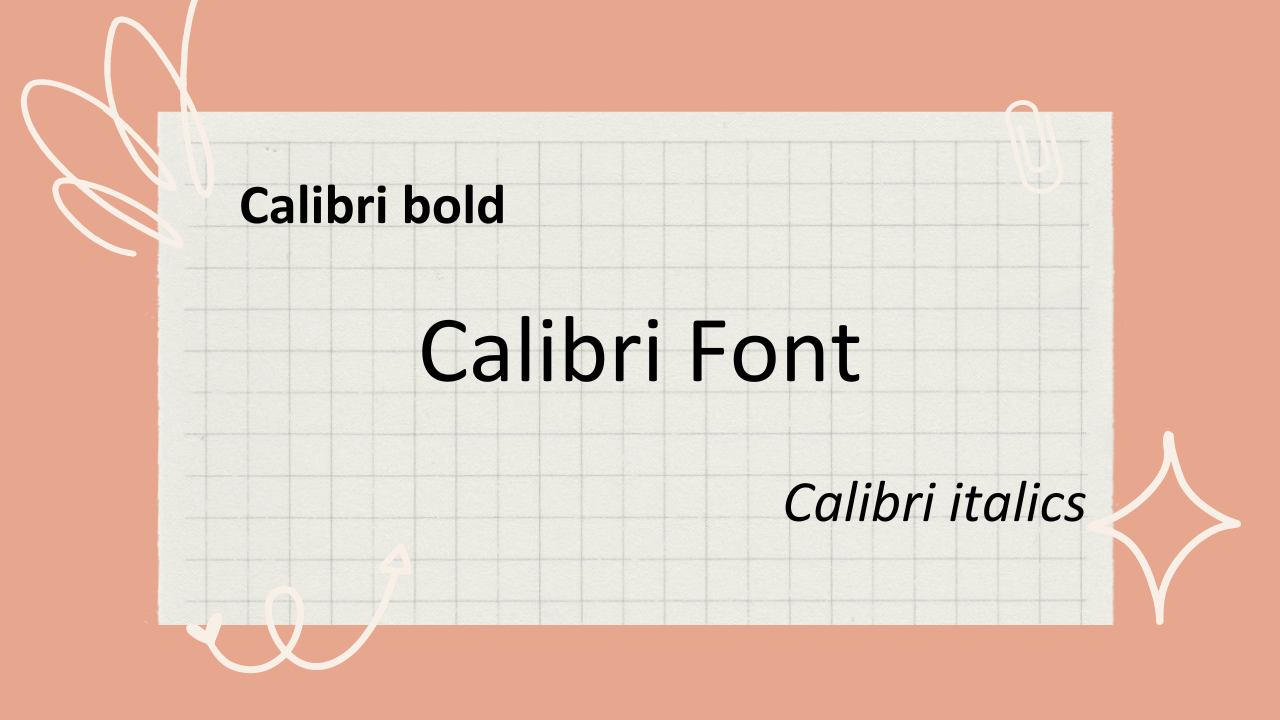
Calibri Font. Image created via Canva.
Ideal font for a school essay: Arial
When it comes to the right font for graded essays, you're looking for a professional and readable ascetic. That means Comic Sans to the back, please.
Calibri is a great choice for it, but I'd select Arial as my top pick for any essays you have to submit. As a clean and modern sans-serif font, Arial offers a straightforward and professional look while maintaining readability.
It was designed by Robin Nicholas and Patricia Saunders for Monotype Corporation in 1982. The font was initially developed as a replacement for Helvetica, which was popular in the graphic design industry but had limited availability for digital typesetting systems at the time.
It's not one of the most decorative fonts, but it looks good and sharp no matter the font size. Here's a sample:
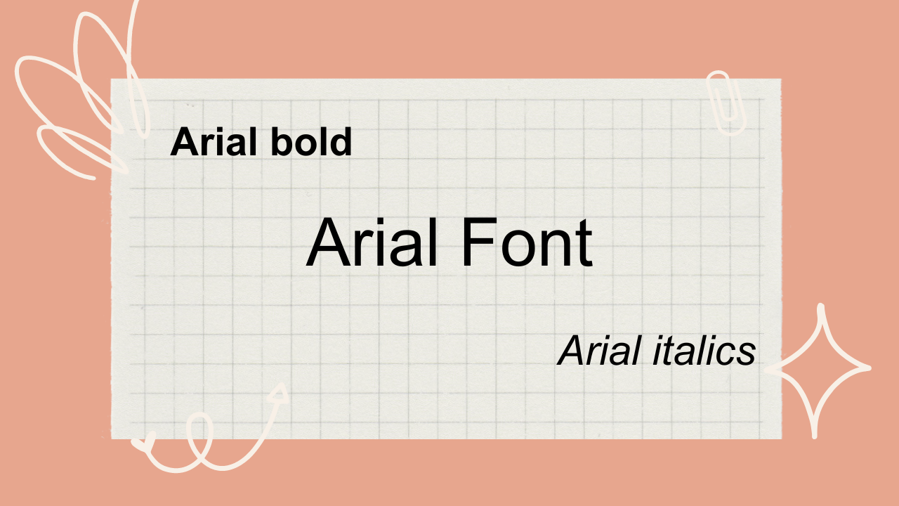
Arial font. Image created via Canva.
Best font for accessibility: Open Sans
This category includes anyone who wants to ensure that readers with dyslexia, screen readers, or any other kind of visual or reading disability can still access your text. Developed by Steve Matteson in 2010, Open Sans is a cousin to Comic Sans MS, and it's an open-source Google font.
I love this font for this purpose because of these features:
Ample spacing: allows for easy reading and comprehension.
Versatility: this font will work in digital, print, headers, body text, and across multiple other mediums.
Recommended by the pros: most importantly, it's recommended in the context of accessibility guidelines, including the WCAG (Web Content Accessibility Guidelines).
Aside from selecting a different font, you should also consider factors such as font size, line spacing, and background color should also be considered to create an inclusive and accessible reading experience.
Here's what it looks like:
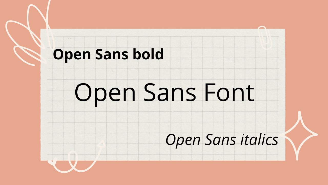
Open Sans font. Image created via Canva.
Top font for your resume: Times New Roman
Unlike essays, you have a new requirement here: you want something that looks pretty. That's why I recommend Times New Roman. It's one of the more decorative fonts, while still remaining firmly readable and professional-looking.
Plus, it's traditional. Developed by British type designer Stanley Morison, it was commissioned by the British newspaper, The Times, in the early 1930s.
Here's a little sample:
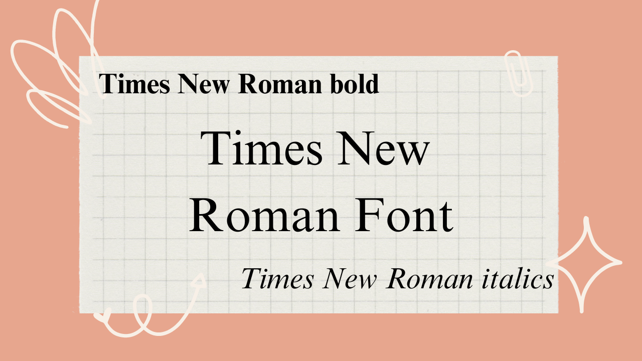
Times New Roman font. Created via Canva.
Top font for designers: Helvetica
I looked on Reddit to see what the top choice was, and most people said Helvetica due to its clean and timeless design. It has a neutral appearance that can adapt well to various design style.
Other fonts mentioned were Montserrat (my personal fave), Roboto, Josefin, Work Sans, Lato, and Mate.
Helvetica is built to spec, too – it was created by Swiss typeface designers Max Miedinger and Eduard Hoffmann in the late 1950s. They wanted to develop a neutral and versatile font that could be used across a range of applications, from advertising to signage and corporate branding.
Here's what it looks like:
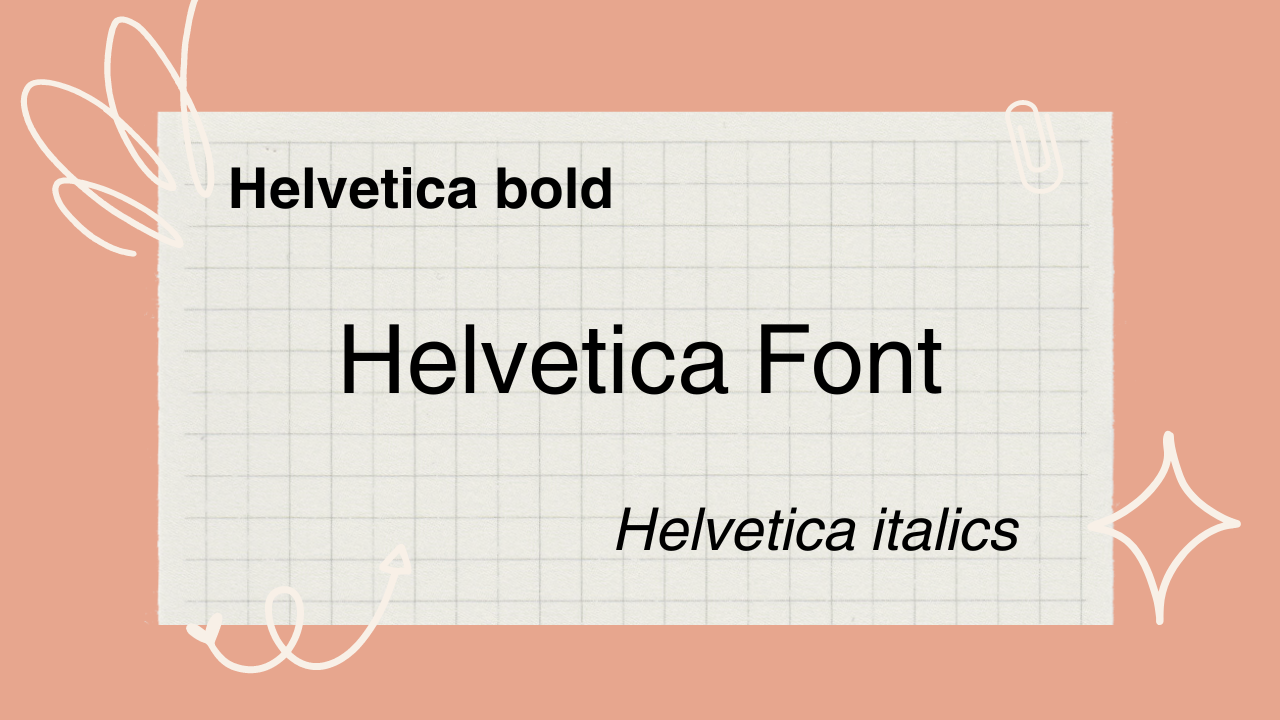
Helvetica font sample. Image created via Canva.
Most readable Word font: Verdana
Many of the fonts I've mentioned above are very readable, but Verdana takes the readable cake. It's a in the sans-serif fonts family, designed specifically for digital screens. Its generous spacing and large x-height contribute to its legibility, especially at smaller sizes.
It was designed specifically for Microsoft by Matthew Carter in the 1990s with wide letterforms and generous spacing.
Curious about what it looks like? Here's a snapshot:
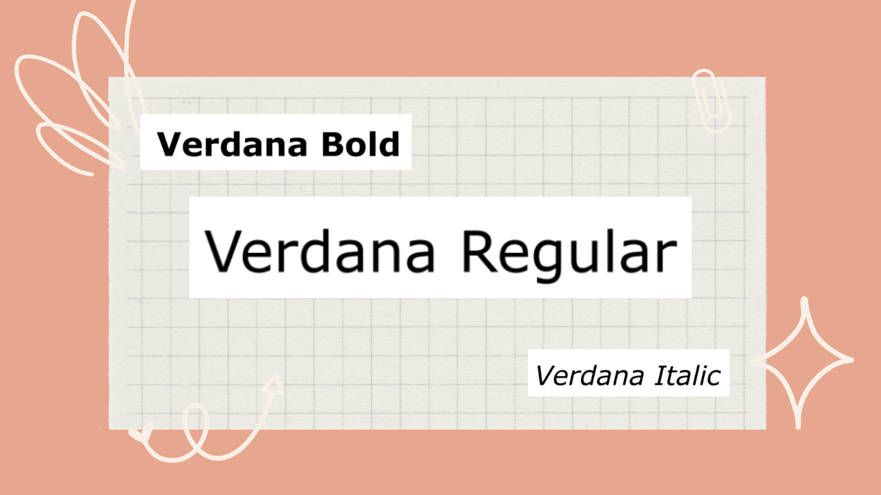
Image created via Canva. Slightly jankier-looking as I had to source samples from Font-samples
Most compatible Word font: Georgia
My home state! And also one of my favorite serif fonts. Georgia is widely supported and available on different platforms. It is commonly used for web content and is considered a highly compatible choice.
Another Matthew Carter original, this one was commissioned by Microsoft as part of their initiative to enhance the legibility of text on computer screens.
Here's a sample:
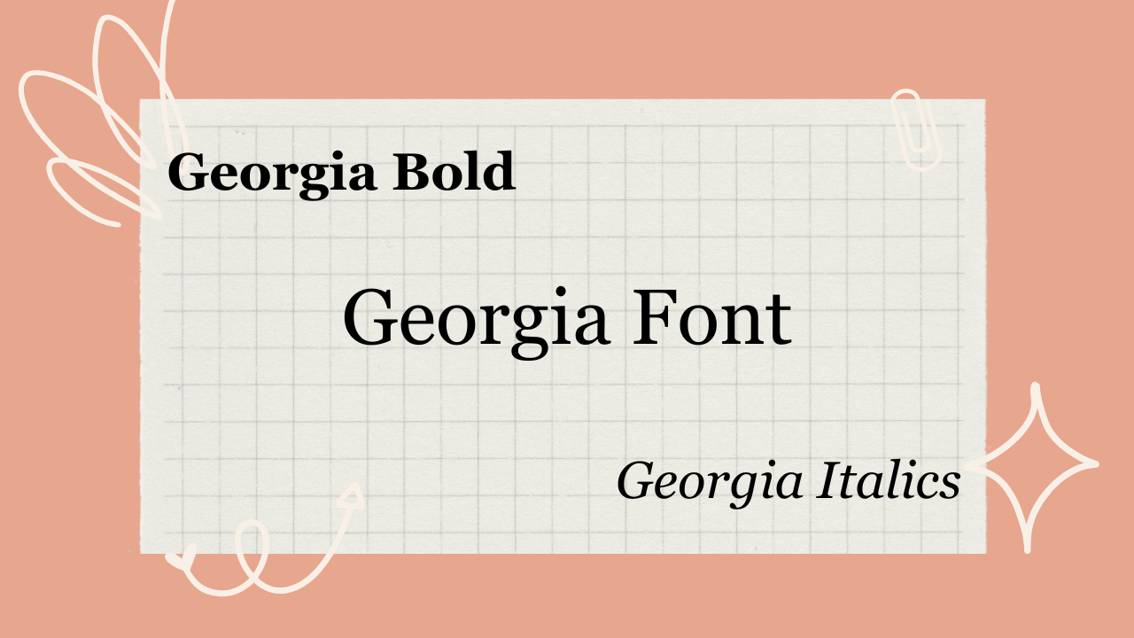
Georgia font sample, created via Canva
Most usable font for your website: PT Sans
PT Sans is a versatile and readable sans-serif font that supports various languages and character sets. It has a neutral design and works well for both body text and headlines. That's why it's so great for almost any website design.
Designed by Russian type designer Alexandra Korolkova, in collaboration with Olga Umpeleva and Vladimir Yefimov, it was released in 2009 as part of the PT Fonts project, which aimed to create a set of free and open-source fonts for public use.
This is what it looks like:
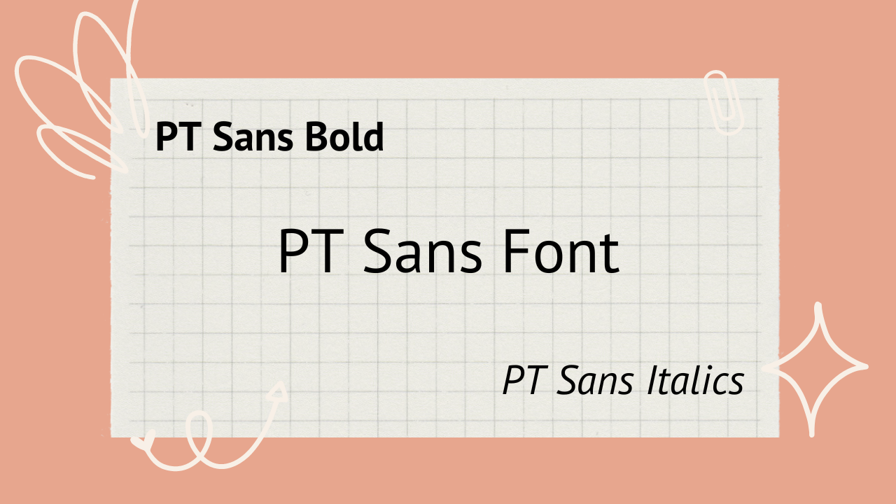
PT Sans font sample, image created via Canva
Best fonts — for you: Your choice!
Honestly, if you've scanned this whole list and haven't found anything suitable, I recommend you spend some time browsing Reddit's designer subreddits and poring through Google Fonts. The world is your oyster.
You don't even have to limit yourself to a particular family. For instance, serif fonts are known in the industry as being more legible, but one study found there was very little difference between a serif typeface and sans fonts.
As I mentioned, my personal favorite is Montserrat just due to its sleek look and attractive sans-yness. But you may be different!
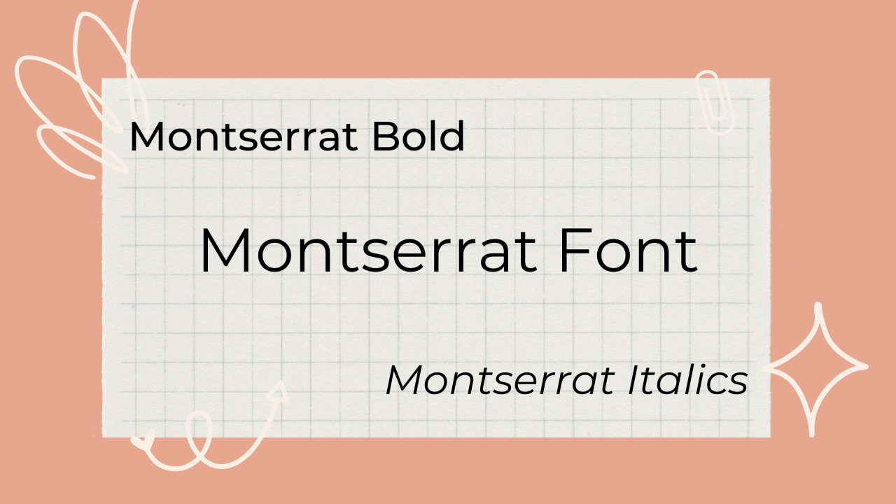
Montserrat (author’s favorite) font sample, image created via Canva,
Bonus: Worst font to avoid
Any kind of cursive font is almost always a no-no in design. Practice your hand calligraphy all you want, but there's a reason the majority of the web uses typewriter-style letters.
Especially for legal documents, web design, or anything else that will be seen and judged by your peers, employers, or colleagues, your font selection should be neat and readable.
I also recommend any kind of special characters, commonly used to differentiate usernames on platforms like Twitter. These are almost impossible for screen readers to parse appropriately.
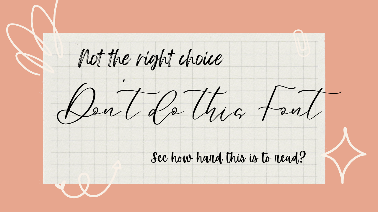
Image created via Canva.
FAQ
Where can I get fonts?
Bored of Microsoft's own fonts? A great place to look for more is Google Fonts. These are easily downloadable and will work across almost any online context.
What's the difference between a Serif and a Sans font?
The main difference between them lies in their letterform design and the presence or absence of small decorative strokes known as serifs.
If you look at Georgia's G, you'll see it has little ticks on the ends of the letter. By comparison, PT's S has no ticks - it's a clean line.
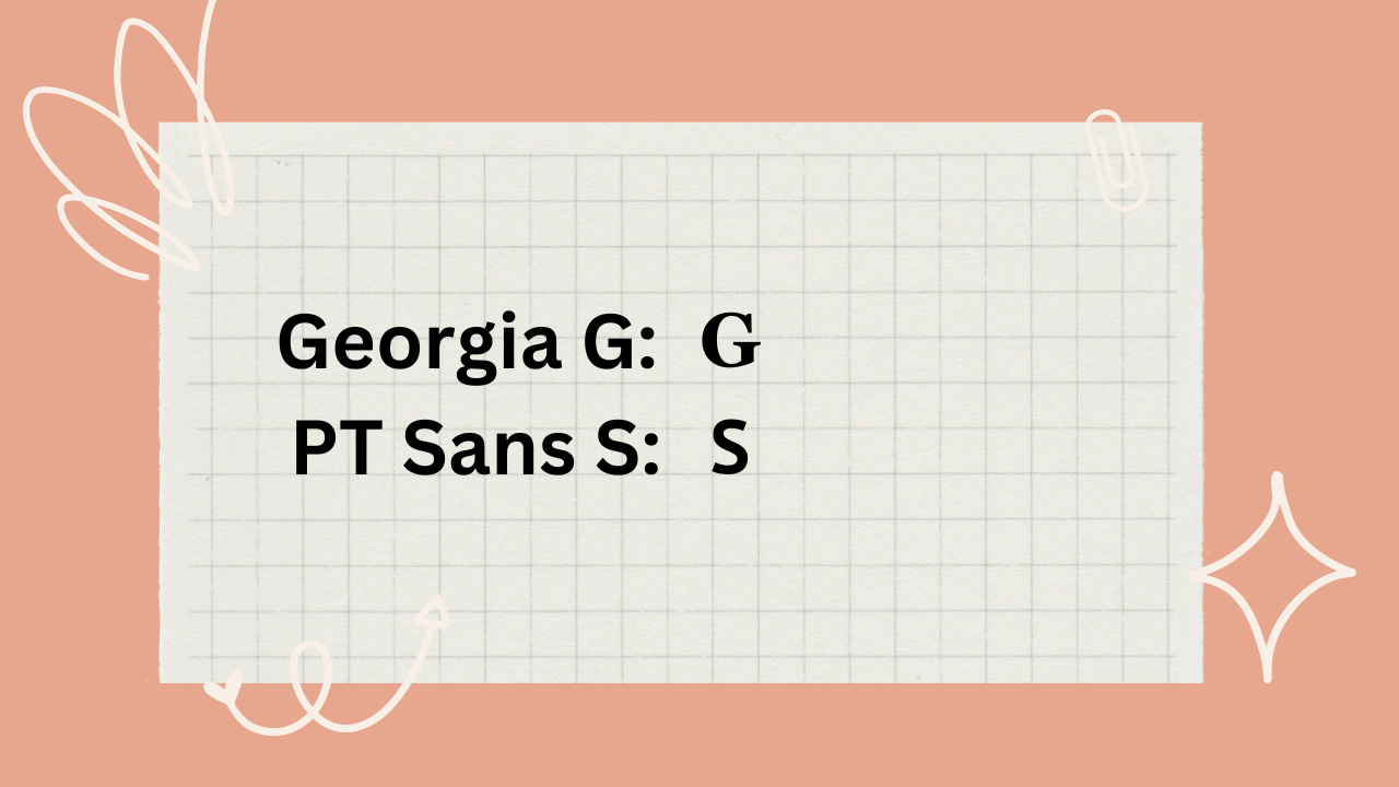
See how the Serif font has the distinguishing ticks, while the Sans font is smooth?
Serif fonts are often preferred for lengthy text passages, such as books and articles, where the serifs aid in guiding the eye along the lines of text. Sans-serif fonts are popular for digital content and headings, where legibility on screens and a modern appearance are prioritized.
Typeface vs font?
Although typeface is often used interchangeably with font by design noobs like me, there is a distinction in the field of typography.
A typeface refers to a set of designed characters that share consistent design attributes such as stroke width, shape, and overall style.
Meanwhile, a font is a digital file that contains the data necessary to display or print a specific typeface at a particular size, weight, and style.
What other fonts are good?
There are so many! If you're ever looking for the optimal choice for whatever application, I recommend looking for fonts that were specifically designed or used in that capacity.
For example, Franklin Gothic was used in the Star Wars subtitles. A great choice. Playfair Display is commonly known for making logos due to the high contrast between its thick and thin lines.
Hope you enjoyed this article! Looking for more fonts advice? I recommend you check out these subreddits:
Happy fonting!